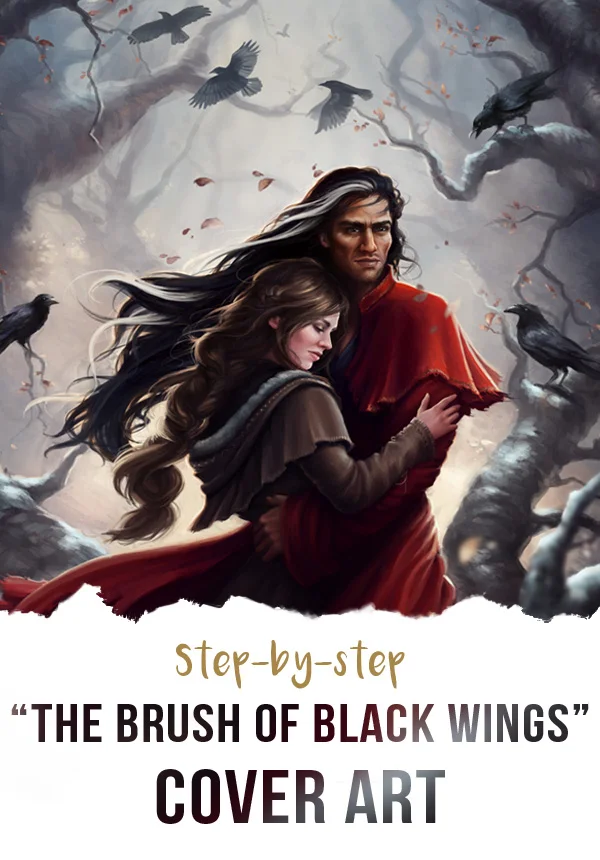
I got a shiny new computer built not too long after this was completed and I finally pulled the last few folders off my backup HD and onto my current one - including the step-by-steps and notes I'd saved out for the progress post on this cover. The author, Grace, has been posting lately that she's on the home stretch towards finishing the manuscript for this book, so I figured it was a good time to return to it.
To start; thumbnails and experimenting with type and layout. I don't use thumbnails as much as I should but they're definitely a must when working for a client. It also helps when finding a composition that works with the type treatment. Additionally, Grace and I are good friends but we each have different tastes in cover art, so what I might instinctively go for is not necessarily what she would like (for example, she prefers faces to be partially obscured or hidden whereas I am the opposite and have to fight myself not to show them off) . Luckily she is very descriptive and provides tons of reference for what she wants and I try a lot of different options to try and incorporate her ideas.
The key things to include here are a medieval look, a dark moody feel hinting at the romance, the roses, a shadowy hero and a strong, elegant heroine. Grace was also font of several covers that used frames in the composition.
Grace and I picked out several things she liked from the first round of thumbnails, and I worked up three more detailed sketches. The favourite was number 2, with a few modifications to the Beast character (as this was a romance, placing the man rather than the Beast on the cover created a wider commercial appeal. But I had a few ideas up my sleeve for hinting that this was still a Beauty and the Beast retelling).
Next up, adding colour, fixing anatomy and a little fashion design. With a fantasy setting, perfect historical accuracy was less important as long as the medieval feeling came across, so the characters' dress was brought together from many different references. Including many repeated oglings of the costume porn in The Tudors TV series. Oh the sacrifices we must make for art...
Louvaen's dress almost received a colour makeover but ultimately I felt the sleeves broke up the bold statement the pure red dress made. Entreat Me was going to be published digitally so I had to consider how the cover needed to attract readers in a thumbnail size on Amazon. Besides that, we had already agreed on a limited colour palette (both for the aforementioned thumbnail considerations and to keep the cover more moody and muted) and sticking to that meant most of my options for the sleeves either blended into the background or were too close to flesh tones, both of which made her arms look detached and odd.
Ballard's features received some sharpening and a lighting change, and his outfit picked up a few additions that hinted at his true nature in the books...
Finally the background was given detail and the rosebushes were added. I always find red a tricky colour to work with and it was a challenge making the roses appear luminous, silky and just a touch too perfect.
A few touches of rich, warm dappled light on a Soft Light/Overlay layer and the type treatment added back in as in the first image posted, and we're done!


