Why Use Vectors?
Professional artists - especially freelancers - have to wear a lot of hats, which usually includes handling all our own branding and learning at least some basic graphic design skills. At some point you've probably wanted to make a logo for yourself. Or you've received a great book cover commission and the client has asked for an elaborate border design. Maybe you're dabbling in making game icons for the first time.
That's where having a handle on vectors is a godsend. They're smooth, sharp, easily editable and of course, they resize without any blurriness or loss of detail.
If you make a regular habit of doing user interface (UI) art, logo design or iconography, it's worth using a dedicated vector art program such as Illustrator or Inkscape. But Photoshop has some pretty useful vector tools of its own - the Shape and Path tools . So for those who like to work within the one program, or who don't have the money or time to invest in a new program right now, this tutorial is for you.
Even though I've spent a ton of time lately doing UI and icon design, I actually don't have an Illustrator license at my workplace. I still use Photoshop. Since vectors are an absolutely necessity for UI work, especially on mobile where flexibility is key, I've become pretty handy with Photoshop's Shape tools. So this is a basic guide for those of you who want to try out vectors without learning a whole other program. I'll show you around the Shape tools, the Custom Shape palette, and teach you how to create, modify and save your own vector shapes. And I'll throw in some best practices and the tips and shortcuts I've learned along the way!
If you've never touched the Shape tool before, hopefully by the end of this you'll be all:
MAC USERS: Whenever I say to hold down Ctrl (e.g. Ctrl + C for copy), use the command key (Cmd) for a Mac.
Getting Started - Basic Shape Layers
When you create a new document and select the Shape Tool (U), you'll see you can create a number of different geometric shapes and Custom Shapes (which we'll get to). Simply pick your shape and then click and drag on your canvas to draw the shape. Hold down Shift while you drag to make your Rectangles perfectly square (or your Ellipses perfectly round).
There are also three different modes of shape you can create.
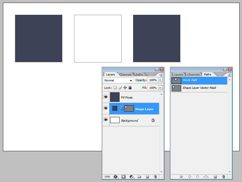
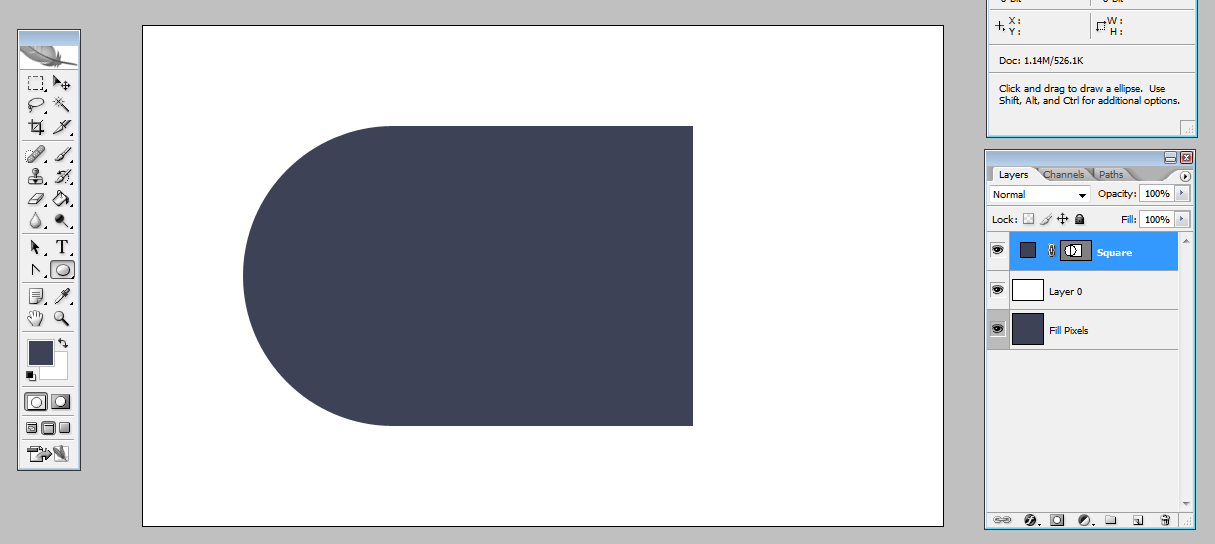
From left to right: Shape layers, Paths, and Fill Pixels. We'll be using Shape layers throughout the rest of this guide, but let's take a quick look at the differences first. Here's a simple square drawn in each mode:
As you can see, Shapes layers and Fill Pixels look pretty much identical at first glance until you take a look at the Layers palette. There you'll see the Shapes layer has a colour and a vector mask, whereas the Fill Pixels square is just a square. That's because Fill Pixels just creates a rasterised shape made of (surprise) pixels, which will go blurry around the edges if you try to resize it. The Paths square isn't even visible unless selected, because it's simply an empty Work Path. If you go to the Paths palette you'll find it, and we could use Fill Path to give it a colour, but we don't need to. As you can see, the Shapes layer already has a path, and it's been created with a colour fill already.
Which brings me to one of my favourite things about Shapes: Changing their colour is a piece of cake. Just double-click on the colour thumbnail in the Layers palette and...
Bam. The colour picker pops up, and you simply choose a new colour. Much easier than fiddling with the Paint Bucket or Hue/Saturation sliders.
Next, I'll show you how to edit the basic shapes to start creating new ones.
Editing a Shape's Vector Mask
Select your shape using the Convert Point Tool which is an option on the Pen Tool (P) menu. This will show you the outline of the shape's vector mask, which you saw in the Paths palette earlier. Next, click on a corner or edge to see the anchor points making up the shape.
Now hold Ctrl/Cmd and click and drag to move any anchor point to a new position. This will also work on any straight edge if you want to move just one side of a shape. Then, if you just click and drag on any anchor point, you'll see a pair of handles appear that control the curve of the two sides next to that point. Dragging from the point adjusts both edges at the same time, but you can now click on either handle to adjust the curve of just one side or another.
Double-clicking on any anchor point resets the curve and straightens the edges again.
You'll notice in the Pen Tool menu that you can also add or delete anchor points, so you can start building up any kind of shape you like from a simple square or circle. But another fast way to start building new and more complicated shapes is to make combinations of existing ones.
But first, a quick tip to make this next part MUCH easier:
Use Grids & Guides for Pixel Precision
Photoshop's guides and grid tools are incredibly useful features for design work. They make aligning and sizing things a snap (sorry...but pun intended), and as you'll see shortly, they're so handy when you're creating simple custom shapes.
Go to Edit > Preferences > Guides, Grids and Slices to set up your grids.
Here you can change the colour and spacing of your grid. I prefer to use a light colour, like grey, which is visible without being too distracting. I prefer having divisions of 4 or 5 pixels between my gridlines. Having 5 means it's easy to create & resize shapes to simple numbers (e.g. 100x100, 125x150, etc). However, 4 can be handy when you're working on web or UI design where screen and element sizes are often in multiples of 4 (e.g. 32x32, 960x640).
Set up your grid as above for now, and press Ok. Go to View > Snap To and make sure Grids and Guides are both ticked.
Now when you draw or transform a new shape, the edges will automatically snap to the gridlines. You no longer have to iiinch your hand across the canvas trying to hit the precise numbers you want while eying the Information panel and cursing.
Since we don't need them visible all the time, you can toggle Grids and Guides off using the keyboard.
Ctrl + ; Toggle Grid
Ctrl + ' Toggle Guides
Now you're all set up, time to learn some combination tricks.
Combining Shape Layers by Drawing
Using your new grid as a guide, create a new Rectangle shape in the center of your canvas, and hold down Shift as you draw it to make it a perfect square. I made mine 260x260, but make yours whatever size you like as long as it's large enough to work with comfortably at 100% zoom.
Next, add some guides in the middle and along the edges (again, these should snap easily to the edges of your shape) so it's even easier to see what we're doing.
Now take a look at the Shapes toolbar again, at the five icons I've indicated:
When you create a second Shape layer, these tell Photoshop if and how you want to combine it with your first one. By default, it's set to Create New Shape Layer which, in a predictable plot twist, creates your second shape on an entirely new layer. The others are Add, Subtract, Intersect and Exclude, which will add your new shape to the same layer and have different effects if that shape overlaps your first one.
Choose the Circle Shape tool. In the Layers palette, make sure the Square's vector mask thumbnail is selected and then press the Add icon in the Shapes toolbar at the top (you'll have to do the first in order to do the second). Use your grid and guides to add a circle to your square like so:
You can see in the layers that this mode has (again, shockingly!) added the circle to the original shape to make a new one. When I deselect the vector mask, the path lines disappear and you're left with a seamless new shape!
And now for Subtract, Intersect and Exclude modes:
Add and Subtract are the ones I use the most, but with experimentation, you can use all of these to create pretty much anything you want.
Now, this is one way to combine shapes, but there's another. If you're building something more complex, you don't want to draw into your shape, realise it's in the wrong place, and have to undo your work and start again. Sometimes it's better to build a picture of what you want first and then bring it all together. Luckily, you can arrange your design on different layers and then combine them into one layer at the end. So now, we're going to try something a bit more interesting than circle and squares.
Combining Shape Layers with Copy & Paste
First things first - sketch your design out. Keep it simple - it doesn't have to be perfect, just something to guide you. If you're following this exercise with me, you can doodle your own dragonfly or you can download my sketch PSD to use (I'll include the link again at the end of this tutorial). I've created the body and wings on separate layers so I can toggle them on and off as needed and keep my workspace clean.
Add a guide line roughly down the middle of your design. We're going to create the body first, so I've turned down the opacity of the wings to 10%, and the body just to 50%.
Create a new shape over one half of your sketch like so, just overlapping the middle guide. You don't have to cover the whole thing - just aim for the general area. Here, I've used the Rounded Corner rectangle (with the radius corner set to 20). It gives me a few more anchor points to start work with.
Name your new shape something appropriate like "Body". When you're potentially working with a lot of layers, take two seconds to give them each a useful name. It's one of the best Photoshop habits you can get into. Reduce the opacity of the Shape layer so you can see your sketch underneath.
Now add more Anchor points where you need to, using the Add Anchor Point tool under the Pen Tool (P) menu. Start pushing, pulling and adjusting anchor points until the shape matches your sketch. You only need to work on one side - we're going to make the design symmetrical later.
Continue down the body until you're happy with your half-a-dragonfly!
Duplicate the body layer and use Edit > Transform > Flip Horizontal to create the other half. Using your centre guide and Grid to help, snap the second half into place so your dragonfly is symmetrical.
Now we're going to combine the two shape layers into one. With the "Body Copy" vector thumbnail selected, hit Ctrl + C to copy.
Next select the thumbnail for the first layer ("Body") and hit Ctrl + P to paste the first shape in. If it doesn't seem to work, be sure you had the vector thumbnail selected and not just the layer in general.
Your two shapes are now combined as one! You can go ahead and turn off the Body Copy layer to see more clearly. Now, an extra step to clean up the overlapping points: Choose the Path Selection tool (A) and look to the toolbar at the top of the screen. You'll see four of the same icons you see in the Shape toolbar - the combination modes.
By default it's set to Add, and you can use it when you've copied and pasted two different shapes together (again, the vector thumbnail of the layer needs to be selected, or the buttons will be greyed out). Now press Combine. This finalizes the copy & paste job by deleting any unneeded anchor points and cleaning up any overlap.
Leaving you with one perfectly symmetrical dragonfly body! I deleted the extra layer at this point.
Now for the wings. Create a NEW Shape layer above your Body for the first wing as we'll be duplicating and flipping it later - you don't want to attach the wing to the body just yet. Make sure it overlaps the body layer slightly. This means we won't have any gaps when we combine the layers later.
Create the wing as you did the body - starting with a basic shape (I just used the Rectangle tool) and then adding and adjusting anchor points to match the sketch below.
(Don't forget to name the wing layer!)
Now for the wing pattern. Use a different colour so it's easy to see what you're doing, and begin sculpting your pattern on another new layer.
Make sure to have Add mode selected when you create each piece of the wing pattern, as this keeps them all on the same layer. But if you forget, and you wind up with a few different layers, don't worry about it. You can just copy, paste and Combine as before until you have a single Wing Pattern layer.
You're going to copy and paste your Wing Pattern layer into your Wing shape as before - except this time, after you hit Paste, go to the Paths toolbar and next to where it says Combine, press Subtract. This will cut out the shape you just pasted in instead of adding it. Hit Combine, and hide your Wing Pattern layer to see the full result!
Duplicate and flip your newly lacy Wing. Then, once again, copy and paste the Wing layers into your Body layer and, with Add mode selected, Combine one more time. Your dragonfly is now one solid shape.
Add the second set of wings in the same way. Paste them into the main body, Combine again, and return your final Dragonfly layer to full opacity so you can see your work complete.
Confession: When I first posted this tutorial, I linked it to a friend for feedback. She pointed out that I hadn't added the second set of wings that I had in my sketch! Once I'd turned my sketch layer off, I'd completely forgotten about them. Whoops. I thought about leaving it - the tutorial still worked from a technical point of view - but my poor, wing-deprived dragonfly was now bugging the hell out of me. So I fixed it and updated the downloadable shape at the end of the tut.
The last thing you need to do is Save your new shape so you can use it in other artwork files easily. With the vector thumbnail of your Dragonfly layer selected, go to Edit > Define Custom Shape. You'll get a popup box asking you to name your new Shape. I was extremely creative and called mine...Dragonfly. Again, it's a good habit to give your creations meaningful names - trust me, if you ever decide to save and share your collection, people will thank you for not giving them an endless list of Shape 1, Shape 2, Shape 3...
Now your Dragonfly is saved in your Custom Shapes panel, so you can access it all the time. You can also save shapes out as you would a brush set, meaning you can save everything you make and install them on any other devices you use Photoshop with, share them online, or sell them.
You can see on the bottom left row of my Custom Shapes panel that I've created a couple of vectors for the simple version of my logo. Any time I want to throw a quick watermark on something - like a work in progress I'm about to post on Twitter - it saves me having to open up another file to get the logo.
And there you go! I've covered the very basics of getting started with Photoshop Shapes, but once you start trying them yourself, you'll see that the possibilities for designing and customising your own are pretty limitless. I find them such a huge asset at work and in my personal design projects, so I hope you do too. And of course, I'd love to see anything you make so leave a comment, or send me a Tweet (@LouisaGallie) to show me anything you came up with. Feel free to ask any further questions of let me know if there's anything in here you'd like me to clear up.
Finally, here's the link again to download my dragonfly sketch to use as your guide if you want to, and you can grab the final Dragonfly custom shape to use as well.
